Extending existing packages: Rmisc
One of my favorite packages is Rmisc. The package includes the summarySE function which I use on a daily basis. The function provides a concise way to get a data frame with mean and standard errors of the mean. It is a great way in conjunction with ggplot to visually show differences between groups. Let’s have a look at a play example; we create a data set, aggregate it with Rmisc::summarySE() and plot the results with ggplot2.
df <- data.frame(Date=as.Date(Date, origin = as.Date("1970-01-01")), BounceRate = bouncerate, Sessions=user)
df$wday <- wday(df$Date, abbr = T , label = T)

## create the well formated data frame to use in ggplot
dfc1 <- summarySE(df, measurevar = "BounceRate", groupvars = "wday")

p1<-ggplot(dfc1, aes(wday, BounceRate))   + geom_point() +  geom_errorbar(aes(ymin=BounceRate-se, ymax=BounceRate+se), width=.1)
p1 + theme_economist(base_size = 16) + ylab("Unweighted Bounce-rate")  + xlab("")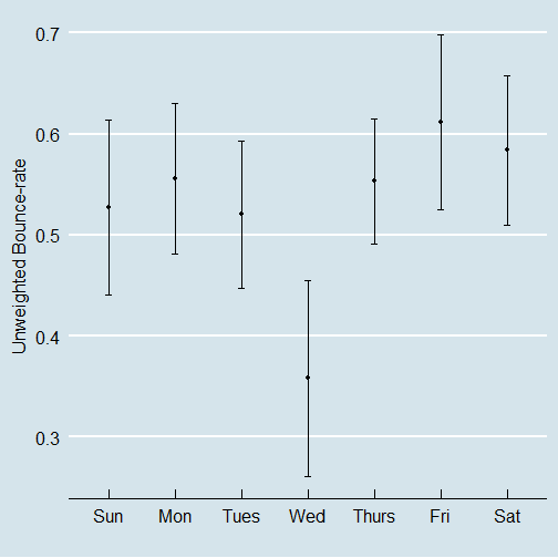
Pretty straight-forward. If you followed this blog, you might have noticed that it is my preferred way to compare statistics between groups. However there is one key drawback. The aggregation in this case is incorrect. It is a mistake to take the mean over a ratio (Bounce-rate) when the N (Sessions) varies over time. The correct way is to use the weighted mean, which yields a slightly different overall mean:
mean(df$BounceRate) ### incorrect way to aggregate## [1] 0.5299905weighted.mean(df$BounceRate, df$Sessions) ### correct way## [1] 0.529783However, Rmisc does not provide the possibility to aggregate means with weights. While I ignored the issue for some time, last week I decided to “give-back” and add a weighted.summarySE function. I looked at the package at the repository, copied the original, and changed some lines. (Please see the full code at the end of the post.)
With that function it is again pretty straight-forward to create the chart.This time with the including the key improvement that the means are correct :).
dfc2 <- weighted.summarySE(df, measurevar = "BounceRate", groupvars = "wday", weights = "Sessions")
p1<-ggplot(dfc2, aes(wday, BounceRate))   + geom_point() +  geom_errorbar(aes(ymin=BounceRate-se, ymax=BounceRate+se), width=.1)
p1 + theme_economist(base_size = 16) + ylab("Weighted Bounce-rate")  + xlab("")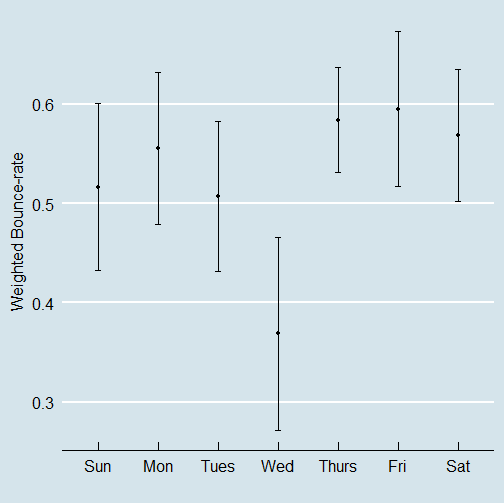
While I still wait for Ryan to accept my pull request; I hope this post inspires you to give feedback or add some functions that you miss in existing packages. Happy extending!
Well ordered source code: