Optimising your blog with R and Google Optimize
When writing a blog, sooner or later, one measures and consequently tries to improve some kind of success metric. In my case; I have been tracking user behavior (visitors, bounce rate, pageviews, …) for slightly over a year with Google Analytics. While some posts have been more “successful” than others, it is not my goal to change the topics and headlining in order to get more clicks. Instead, one metric that I care about is that visitors find value in the stuff they read and subsequently read more of the past blog posts. In order to see if I can tweak this metric I ran a small AB-test over the last two months.
50% of the blog visitors saw a new start page where the excerpt after the blog post headline was hidden. The following images shows the difference between test-setting and baseline-setting.

What do you expect? Did the test-setting outperform the baseline setting in terms of pageviews? As I use a very common jekyll blog theme, my assumption was that the theme authors know more about usability than me and would have optimized for reader-“engagement”. So let’s have a look at the data. The googleAnalyticsR-package allows to conveniently load the data from GA into R.
library(googleAnalyticsR)
googleAnalyticsR::ga_auth()
account_list <- google_analytics_account_list()
ga_id <- 119848123
dff <- google_analytics_4(ga_id,
                      date_range = c("2017-02-19","2017-04-14"),
                      metrics = c("users","sessions","bounceRate", "avgSessionDuration",  "pageviews", "pageviewsPerSession"),
                      dimensions = c("date","experimentVariant"),
                      anti_sample = TRUE)
With the downloaded data, I use the fresh weighted.summarySE function to compare the two key KPIs; bounce-rate and pageviews per session in both settings.
dff$Test <- ifelse(dff$experimentVariant == 0, "Baseline", "Experiment \n Setting")
mm <- melt(dff[, c("Test", "sessions", "bounceRate", "pageviewsPerSession")], id.vars = c("Test", "sessions"))

dfc <- weighted.summarySE(mm, measurevar="value", groupvars=c("Test", "variable"), weights = "sessions",na.rm=T)

p1<-ggplot(dfc, aes(Test, value))   + geom_point() +  geom_errorbar(aes(ymin=value-se, ymax=value+se), width=.1)
p1 + theme_economist(base_size = 16) + xlab("") + ylab("") + facet_wrap(~variable, scales="free_y", ncol = 1)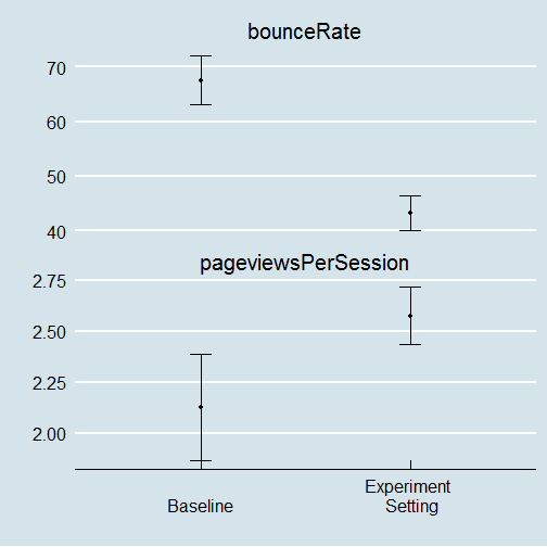
Wow, what a difference; both measures are improved by ~25%. I am seriously surprised by the large effect of such a small change. While I have been testing the effect of interface changes on user behavior before (among others as part of my dissertation), these effects are still a surprise.
As of yesterday, I stopped the experiment and permanently changed the blog-layout to be slightly more compact but 25% more successful ;).