Cluster Analysis - Naming Pattern in the last Century.
A while back I got interested in (baby) surnames. It is interesting to follow how friends name their newly born. There are various naming “strategies”, a) pick a name that has been used in previous generations but now uncommon (e.g. in Germany that would be Oskar), b) pick a biblical name that never ages such as Johannes or David, or c) use a interesting sounding “foreign” name (e.g. Alina).
I thought it would be interesting to figure out if we can cluster names and uncover these patterns (if they do really exist.) in a real dataset. Next, I scraped the last 116 years of data from this German source. Due to Germany’s federal system there is no single consolidated database for birth statistics or naming data. Hence, the scraped data is sampled and only providing a ranking of the top 30 or so given birth names per year (at least seperated for boys and girls).
This is what the data looks like.
head(total, 5)## year gender name
## 1 1900 male Erich
## 2 1900 male Franz
## 3 1900 male Georg
## 4 1900 male Gustav
## 5 1900 male JohannNext, we caluclate the average year for each surname by averaging the years a name has made the top 30 list. As a second metric we calculate the popularity as the number of times a name appeared in the top 30 rankings.
dc <- data.table::dcast(total, name~year, fill=0)
melted <- data.table::melt(dc, id.vars="name")
melted$variable <- as.numeric(as.character(melted$variable))
dd <- ddply(melted, .(name), summarise, avgYear=weighted.mean(variable, value), popularity=sum(value)/116)

dd[dd$avgYear == min(dd$avgYear),]
## name avgYear popularity
## 84 Dorothea 1900 0.00862069
## 90 Elise 1900 0.00862069dd[dd$avgYear == max(dd$avgYear),]## name avgYear popularity
## 255 Matteo 2016 0.00862069
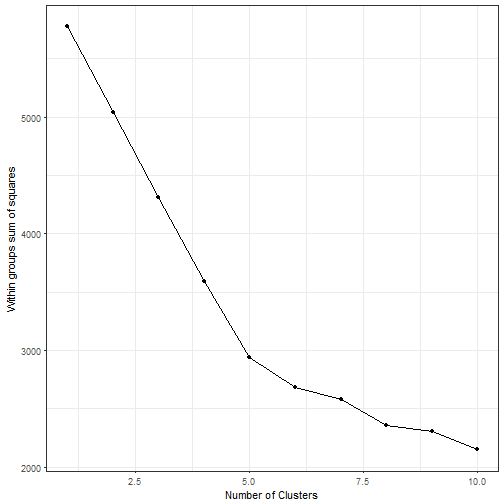
## 267 Milan 2016 0.00862069To determine the optimal cluster number, we use the elbow technique.
######### How many cluster do we need?"
clusterData <- dc[2:117]
ll <- unlist(llply(1:10, function(x){sum(kmeans(clusterData, centers=x)$withinss)}))

ggplot(data.frame(x=1:10,y=ll), aes(x,y))+geom_point()+ geom_line() + xlab("Number of Clusters") + ylab("Within groups sum of squares")+ theme_bw()
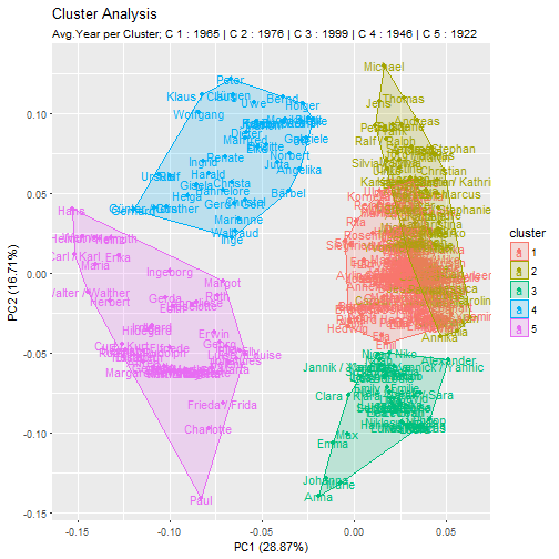
We see that the chart exhibits a kink at 5. Hence, we subsequently do the analysis with 5 clusters. Next, we cluster (using Kmeans) the name data and calculate the average year for each cluster. Using a quick principle component analysis, we can visually inspect the name clusters.
require(ggfortify)

fit <- kmeans(dc[2:117], centers=5)
dc$cluster <- fit$cluster

mm <- merge(dc, dd, by="name")
clusterAge <- ddply(mm, .(cluster), summarise, m=mean(avgYear))
subtitle <- paste("Avg.Year per Cluster;", paste(paste("C", clusterAge$cluster, ":",round(clusterAge$m)), collapse =" | "))
row.names(mm) <- mm$name
mm$cluster <- as.factor(mm$cluster)

autoplot(prcomp(dc[,2:118]), data = mm, colour = 'cluster', label=T, frame = TRUE) + ggtitle("Cluster Analysis", subtitle =subtitle)
Looking at the average years per cluster, we see that they are apparently well separated. The cluster supports this finding; Take cluster 5 as an example; Ingeborg, Walther, Charlotte and Hans are all rather old-fashioned names.
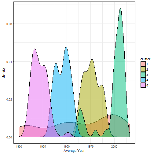
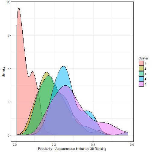
Sometimes mean values do not tell the whole picture. So, let’s see if we can identify patterns when we plot the distribution of average ages as well as a cluster’s popularity.

We see three similar distributions (cluster 5,4,2), just shifted by ~30 years. Two distributions are noteably different. Cluster 3 has a bi-modal shape: A first peak appears in the late 60s and bigger peak from 2000 onward. The most different is cluster 1; the distribution spreads out across the whole century. If we look at the popularity distributions we see that the same cluster 1 is the least popular. The names appear in less than 10% of all top 30 rankings.

Also, the older cluster appear to be slightly more popular in general. To sum up, with a cluster analysis we did not directly find the initially hypothized pattern. We did find though that names are clustered in time periods and grow out of fashion.
It is important to remember the input’s data structure. We created name cohorts by clustering across a binary coding over years. The rows indicate names and the columns the years. In a sense that is a wide sparse matrix. It is not the only way to structure the input data. Another way would be to aggregate the key features (e.g. max, min, average, sd of the appearing years) for each name first and cluster the names second.
Also, Kmeans is not a great pick for categorical/binary data. One could try using partitioning (clustering) around medoids (PAM), or kmodes. (I also tried to cluster the data using the klaR::kmodes function, but I could not see a substantial difference.)
In contrast to a supervised analysis, the unsupervised approach leaves more room for interpretation and degrees of freedom. Before writing this post, I looked for clustering examples with a focus on interpretation and applicability to business problems. The closest I found was this analysis. If you have a good hint, please send me an email.
If you want to reproduce the results, the dataset can be found here.