Maps are great - German Gas Prices illustrated
One of the most appealing data visualisation charts are maps. I love maps as they combine an incredible information density with intuitive readability. Also I feel that most people prefer maps over other visualisations. (Is there research on this?) So it is time to get R-map-ready.
As a play example, I downloaded all German gas stations which are next to the “Autobahn”. Along with the names, I got the exact locations (in form of latitude/longitude) and the price of gasoline at each station. (Prices are in Euro and taken on a Friday night in a time span of roughly 30 minutes.) For starters, we just plot all gas stations on a map and color them depending on their price for (super e5) gasoline.
Germany.map = get_map(location = "Germany", zoom = 6, color="bw")  ## get MAP data

p <- ggmap(Germany.map)
p <- p + geom_point(data=dfff, aes(y=lat, x=lon, color=price))
p <- p +scale_color_gradient(low = "yellow", high = "red", guide=guide_legend(title = "Price"))
p  + theme(axis.title=element_blank(),
           axis.text=element_blank(),
           axis.ticks=element_blank()) + ggtitle("All Gas Stations along the Autobahn")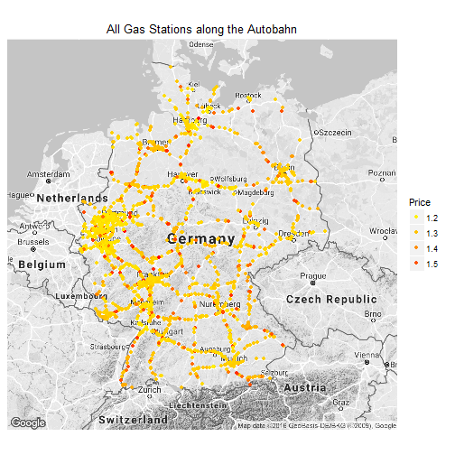
The Autobahn is clearly marked by the yellow/red dots.
In a second step let’s create a density-based map. It ignores prices but takes the 2D-density of gas stations into consideration. It answers the question: where are the most gas stations per square mile?
options(stringsAsFactors=T)  ## need to run this --- weird ggplot bug=!
p <- ggmap(Germany.map)
p <- p  +  stat_density_2d(bins=30, geom='polygon', size=2, data=dfff, aes(x = lon, y = lat, alpha=..level.., fill = ..level..))
p <- p  +  scale_fill_gradient(low = "yellow", high = "red", guide=FALSE) +  scale_alpha(range = c(0.02, 0.8), guide = FALSE) +xlab("") + ylab("")

p  + theme(axis.title=element_blank(),
          axis.text=element_blank(),
          axis.ticks=element_blank()) + ggtitle("Gas Station Density")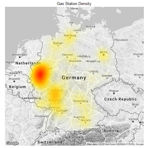
A more interesting question might be: are there regional clusters with higher prices? In order to illustrate regional prices, we can cluster prices regionally (stat_summary_2d) and plot them as tiles on top of the map.
p <- ggmap(Germany.map)
p <- p  +  stat_summary_2d(geom = "tile",bins = 50,data=dfff, aes(x = lon, y = lat, z = price), alpha=0.5)
p <- p + scale_fill_gradient(low = "yellow", high = "red", guide = guide_legend(title = "Price")) +xlab("") + ylab("")
p  + theme(axis.title=element_blank(),
           axis.text=element_blank(),
           axis.ticks=element_blank()) + ggtitle("Gas Price Clusters")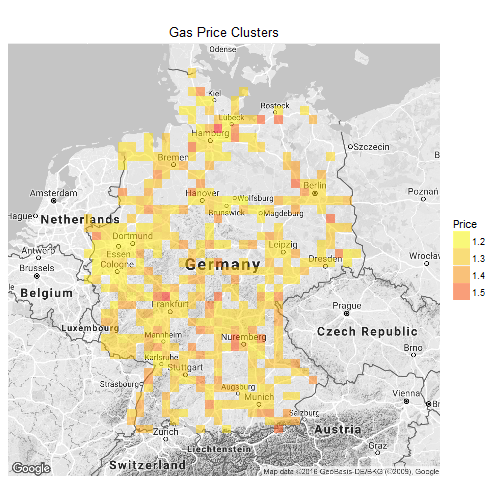
While that gives some insight, it feels clunky. A better way is to cluster the stations by price (using cut2) first, then show the cluster density on individual maps (with facet_wrap).
require(Hmisc)
dfff$priceGroups <- cut2(dfff$price, g = 4)

p <- ggmap(Germany.map)
p <- p  +  stat_density_2d(geom = "polygon", bins = 30,data=dfff, aes(x = lon, y = lat, alpha=..level.., fill = ..level..))
p <- p+ facet_wrap(~priceGroups) + scale_fill_gradient(low = "yellow", high = "red", guide=FALSE) +  scale_alpha(range = c(0.02, 0.8), guide = FALSE) +xlab("") + ylab("")

p  + theme(axis.title=element_blank(),
           axis.text=element_blank(),
           axis.ticks=element_blank())  + ggtitle("Maps by Gas Price Cluster")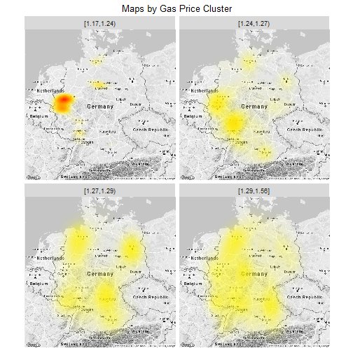
I hope that short play example showed what can be (easily) done with maps in R/ggplot.
Here are the 3 take-aways:
- use
stat_density_2d(geom = "polygon", bins = 30,data=dfff, aes(x = lon, y = lat, alpha=..level.., fill = ..level..))to plot the DENSITY of x/y coordinates on a map. - use
stat_summary_2d(geom = "tile",bins = 50,data=dfff, aes(x = lon, y = lat, z = price)to plot the AGGREGATION of a third variable (e.g. Price) on a map options(stringsAsFactors=T)needs to be set, in order forstat_density_2d(geom = "polygon" )to work; for more “details”, see Stackoverflow.